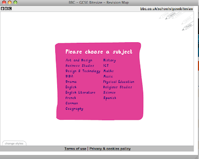
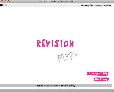
I really like the hand drawn type style used above for the revision links, the rough, doodle style is perfect for the audience along with the small rough drawings in the corner of the page. I think this style suits the audience perfectly as it's like a school kid would doodle in a notebook or similar.
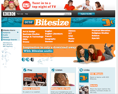

BBC have created a homepage with a blue and orange colour scheme- something with high impact to attract and appeal to their target audience of teens. The site also contains a chat area where teens can talk to others about work etc and also other interactive parts to the site like listening to revision and playing games appropriate to a subject. These aspects of the site are directed perfectly towards it's target audience and works well to cater for them.


