Wednesday, 26 May 2010

Speaking from experience- freshers packs

I'm looking at freshers pack to get an idea of what exists for freshers in the way of giving out free products that will appeal to students.

There seems to be a lot of brown packages created already, maybe something different to this would be best. They all seem to be quite basic too with some kind of logo or design on.


This is probably the most unique one I've come across,kind of looks like some kind of laundry basket but with slogan on it makes it appeal. I also like the fact that it can be carried as it has handles like a little bag.

The Don't Panic pack is something we recieved on freshers, more of an envelope than a box which I'm looking at making. However it works really well and something which is recognised over a range of people.

Monday, 24 May 2010

Human Empire


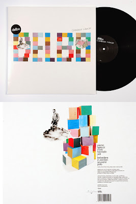
Looking through their website, Human Empire appear to have produced a fair few CD covers for bands. I like the mix of styles they have. I also really like the photographic work mixed with illustration, I have tried this in the past and would like to give it another try. I think it depends on the contect it's used in and how it is used,but this works really well because it is minimal and subtle.

Steph Baxter- ex student

From the usesful links bit on moodle I came across Steph's work. Her typography work is something I really like the style she uses along with the drawings she places behind and around the type. Whilst being limited, the colour schemes she uses with each one work perfectly together sticking to a certain few colours which compliment each other. I like the fact that the type is the main focus of the pieces but has this extra complimenting detail surrounding it.


Sunday, 2 May 2010

Jenny Holzer

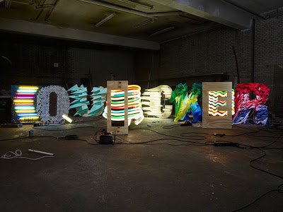
I visited the Baltic in Gateshead where the was a projection and light exhibition on by Jenny Holzer.I liked the fact that is was based around language and text and so I looked into her work more. I found some things that I really like the importance of the language used, I would like the focus of my work to be similar, although I am attempting to use humour I want this to be the importance of the products.


Linda Zacks


I like the collage used to make up the A above along with some brush marks and adobe effects.
I

Tuesday, 27 April 2010

Magazine Layouts

I like the black and white tones used in this layout above. I do like that one page is allocated to a large image it gives it emphasis and allows you to focus on it. I also like the minimal amount of text and therefore the large areas of white and black space.


What I like about this layout is that it contains its text in three different circles, an individual way of laying out the text. Positioning small images around this it makes it more visual but still the circles take focus. With the typeface that is used it doesn't sit within the circle but verges out onto the background, I like this style as it isn't strict and precise with boundaries.


Again this layout allocates one whole page to a large do souly minating photograph, I do like this style because it merges in with the opposite page because of the background colour. I also like the use of a large quote on top of the photgraph so it isn't just image solely. The dark tones work really well together with just one colour used with it to break it up.