Tuesday 27 April 2010

Magazine Layouts

I like the black and white tones used in this layout above. I do like that one page is allocated to a large image it gives it emphasis and allows you to focus on it. I also like the minimal amount of text and therefore the large areas of white and black space.


What I like about this layout is that it contains its text in three different circles, an individual way of laying out the text. Positioning small images around this it makes it more visual but still the circles take focus. With the typeface that is used it doesn't sit within the circle but verges out onto the background, I like this style as it isn't strict and precise with boundaries.


Again this layout allocates one whole page to a large do souly minating photograph, I do like this style because it merges in with the opposite page because of the background colour. I also like the use of a large quote on top of the photgraph so it isn't just image solely. The dark tones work really well together with just one colour used with it to break it up.

Thursday 22 April 2010

Sarah King


I like this type and image work by Sarah King because it is sucha simple idea taking something that exists and using type on it to a ssociate some kind of saying, eg the apple one reads 'an apple a day..' Varying the type sizes and the way it has been photographed makes it work so well. I like the idea of taking something already existing and modifying it to create something with a whole new meaning and purpose.

Handlettering

From the book Playful Type

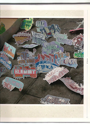
I love these small cut outs, each with a different hand drawn designs on. These design appear to be names but the designs and type are individual to the certain person. I particualarly like the design which use the pink and blue situated to the front of the picture because of the type, something like this would appeal to the audience I am aiming at for this project. I like the idea of creating something similar for my speaking from experience brief, different diesgns for different

This al[habet is made up of letters which seem to be representing something to do with the world or culutre, displaying city scapes and mountains etc. I love the handdrawn style used here and how basic some of the letters are and some of them subtle like the I love you x x x.

Wednesday 21 April 2010

Packaging free clothing invitation


Again, this is from the book G1. It is an invitation to launch of packaging-free clothing range by Target. Items of excessive clothing packaging incluing card, tissue, polythene, plastic clips, were over printed with the message.
With the use of the collage packaging it creates an emphasis and focus on the topic of the invitation.

Inflatable Postcards


I found this image in the book G1 Subj: contemp. design, graphic by Lewis Blackwell and Neville Brody. It uses an existing world wide way of communicating, but it had been taken and improved and makes it so much more intriguing and interactive than a standard postcard.

Absolut Vodka advetisement

This advert caught my attention because of its use of type as image along with the atmosphere it creates with the music and the scenes. I like how it creates different type to potray an overall message of the advert and I like that it has used specific objects and scenes to create the kind of tranquil affect that it has done.

Steps


I found these steps near to the Baltic gallery on Gateshead Quayside and thought it was an interesting idea, linking the idea of steps and words with slipping up.